Dank Syndicate Rebrand
Logo + Packaging Development
Dank Syndicate tapped me to help elevate their visual identity as they carve out space in the premium cannabis market. Known for some of the most potent and flavorful strains out right now, they needed a look that hit just as hard as their product.
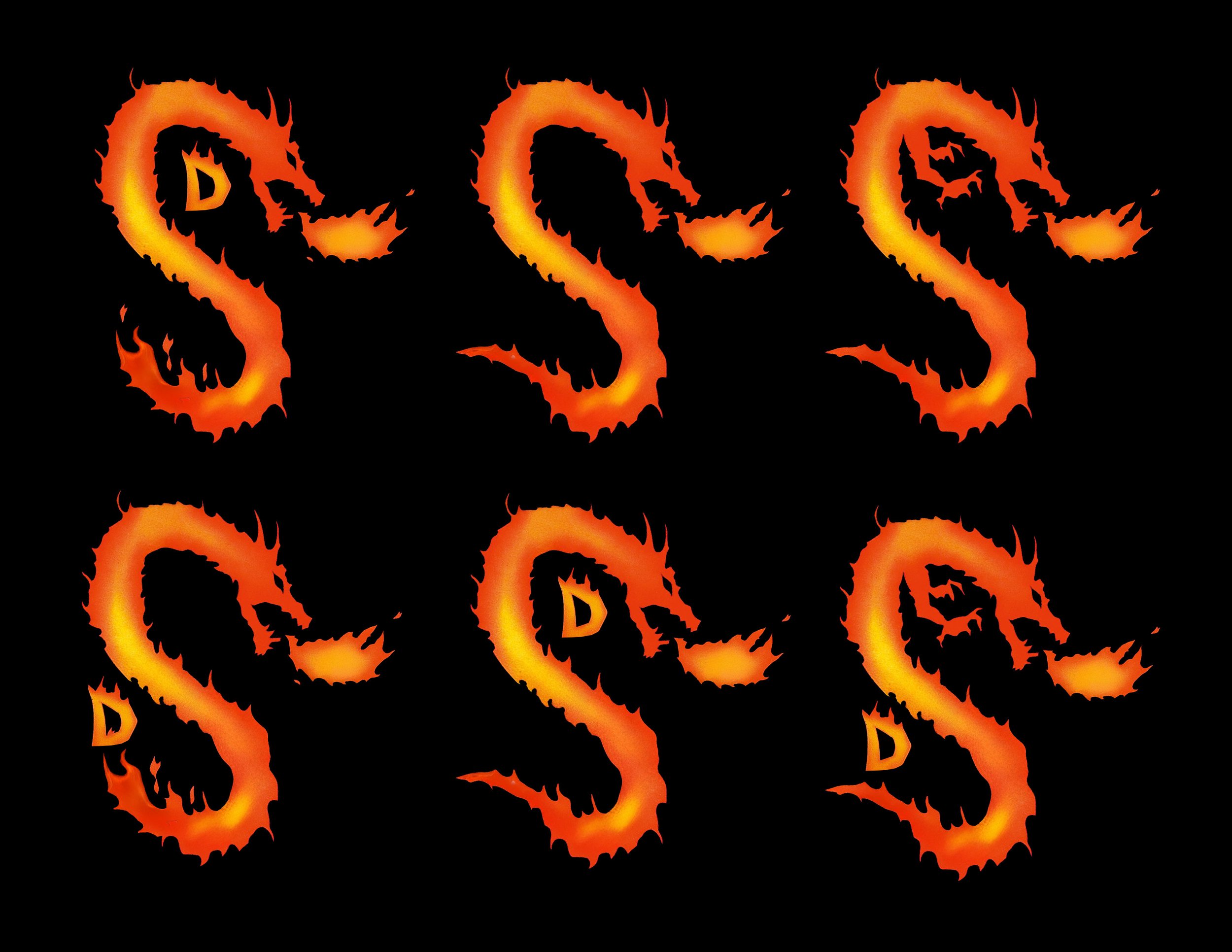
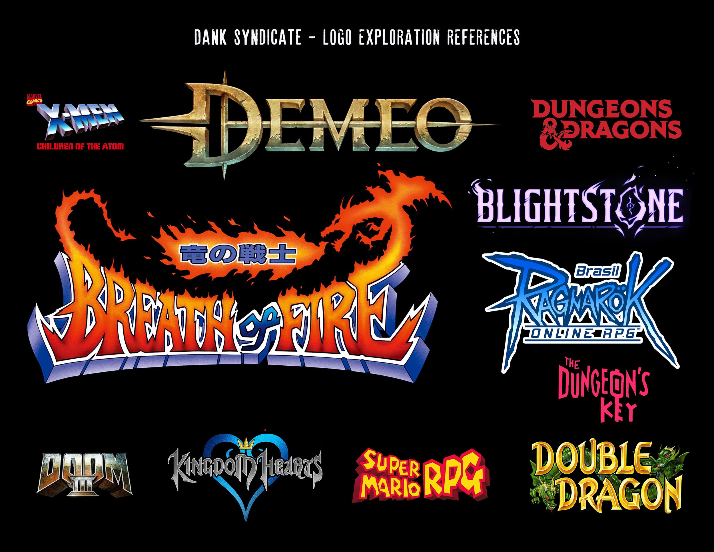
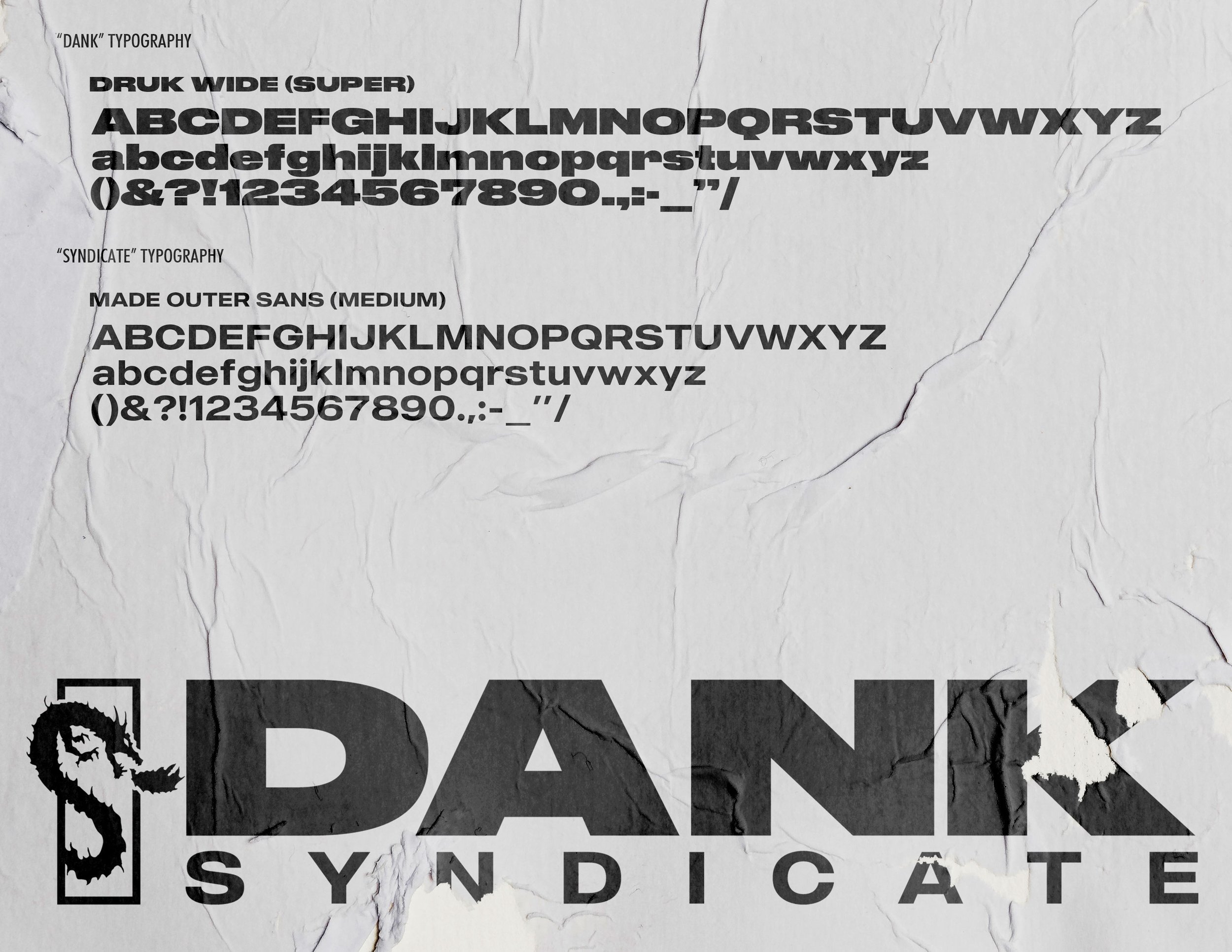
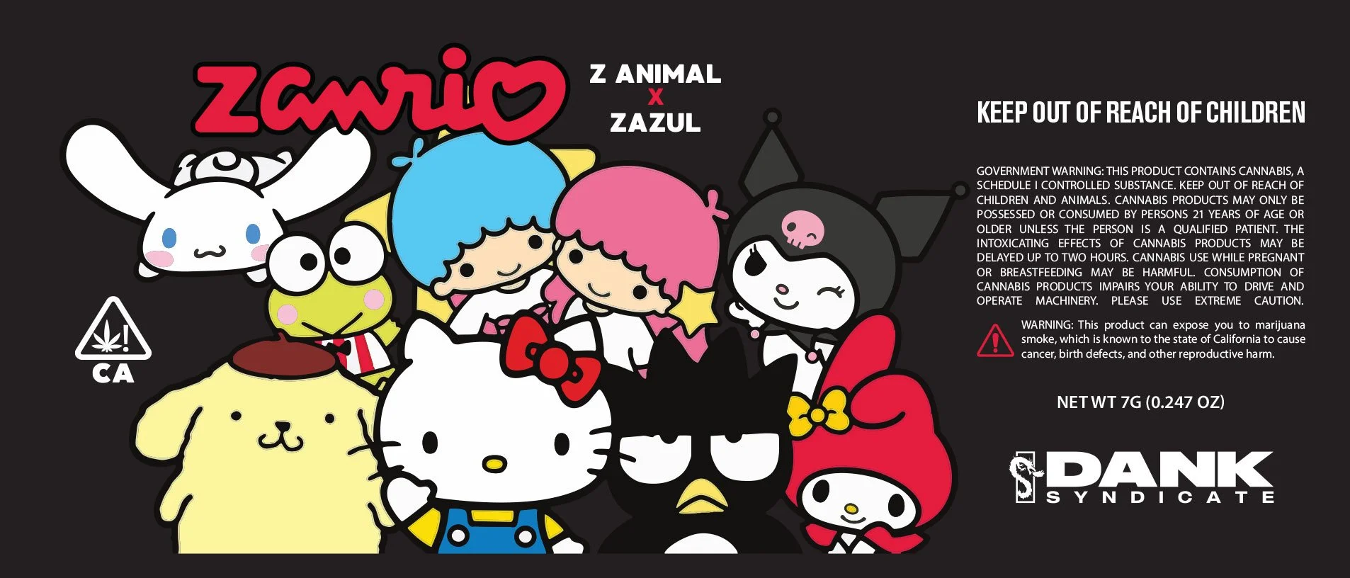
I began with a rebrand centered around bold, underground energy—clean but aggressive, with a graphic bite. The updated logo system blends gamer influence with sleek minimalism, while the “S” mark doubles as a dragon-infused symbol of power and legacy. We're now in the process of rolling out upgraded packaging and labels to match—designed to pop on shelves while signaling quality and trust.
This is just the beginning for Dank Syndicate. Big things on the way.